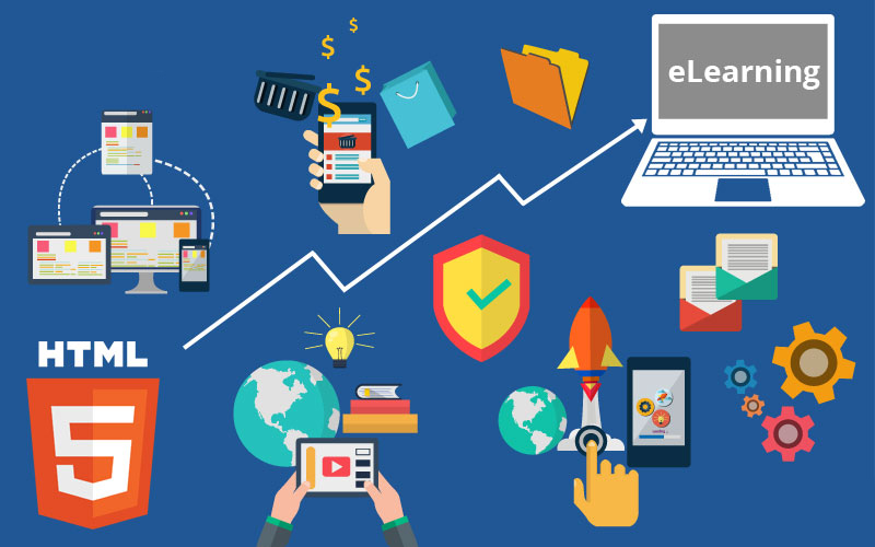
Just a few years ago, Flash was the default authoring tool for online courses. However, with rapid advancements in technology, Flash-based development became highly undesirable. There are many reasons, but essentially, Flash-based development courses require browsers to download a plug-in, for which, at least on the latest mobile devices, is outdated. In addition, Flash is not SEO friendly.
This has caused various organizations to begin their migration to HTML5 to support all their eLearning requirements. Here are a few benefits this migration can bring:
- It can make the most of existing content.
- It is more accessible.
- It can be easily managed.
- It is more interactive.
- It provides personalized learning.
- It saves time and money.
Approach 1: Mobile-Friendly Designs
These reflect the more commonly available design approach (Adaptive learning) that has been adopted to design m-Learning courses. In this approach, the designs offer multi-device support, but they still work for learners who use laptops or personal computers. This approach does extend impeccably to tablets; however, in Smartphones, it works partially, and only in landscape mode. When viewed in portrait mode, a blank space appears as the design moves to a viewable area.Approach 2: Responsive or Mobile-First Designs
In this approach, the designs offer a multi-device support, although the major difference is that designs here completely work for smartphones. Unlike the first approach, the design adapts to the viewable portion and, therefore, the user gets the desired result in both portrait mode and landscape mode on their smartphone. This approach should be used when you expect the bulk of the content consumption to be on smartphones. Let us look at the highlights of a migration process you can adapt to ensure high-quality output:- Collect and Extract Content –This is the initial step to commence in the migration process. Make sure that you have all content, media, and the supporting files before beginning the process. Having all files easily available helps make switching to HTML5 quick, easy, and error-free.
- Pick the Right Tools – Use the right authoring tools as they give developers the power to create high quality courses. Modern authoring tools have several functional features that allows you to create powerful learning materials with a minimum of effort.
- Apply Instructional Design Principles – Consider using learning principles, such as game-based content, exploration, scenario-based learning and discovery, based on the course content.
- Add Inter-activities – Interactivities are often a terrific value to an e-learning program.
- Run Quality Checks and Publish – Before releasing the converted courses publically, always develop a model or prototype and have a trial run with your inner circle.
Summary
Name
Switch to HTML5 Mobile-Friendly eLearning to Generate High Impact Learning Experiences!
Author
Umesh Goyal, Vice President
Published on
July 8, 2018
Kickstart Your Project With Us!
Popular Posts


CONTACT US
Let's Build Your Agile Team.
Experience Netsmartz for 40 hours - No Cost, No Obligation.
Connect With Us Today!
Please fill out the form or send us an email to